You may have heard that Google had recently updated their algorithm to favor mobile-friendly web pages. That's obviously a move in the right direction, considering the growing percentage of people using mobile devices to access web pages.
The movement towards the new responsive approach hotness is all fun & games until you realize it’s not necessarily right for your campaign’s needs. So much so that it could significantly hurt your landing page conversion rate on mobile.
Yes, a responsive landing page, which re-sizes itself to perfectly fit all screen sizes, while doing less work - is indeed tempting to bet on. However...
Specifically in regard to landing pages for mobile targeted campaigns, the metric for success is likely to be different than the desktop page’s metric. This post aims to explain why & how to provide a different option on a mobile targeted landing page, rather than just shrink sizes and shift content around.
The Importance of Addressing Mobile Traffic
That is an audacious statement to make, but recent research by Spotify shows that more than half of all ecommerce traffic was done on a mobile device. The percentages round up to about 40 percent for smartphones and 10 percent for tablets.
The growing number of users turning to smartphones for purchases makes the issue of mobile traffic not only more important in terms of sales, but to the broader context of conversion optimization. Users need to find your business quickly, and end up on a landing page that has a simple and direct call-to-action.
If you are still unconvinced, here is another statistic: about one-third of all Internet traffic is mobile. Estimates are that between 15 and 20 percent of global web connections are done by a smartphone. The reason seems to be obvious, as it is simply a matter of numbers – there are more smartphones in users' hands than at any other time in history. This growing percentage demands that businesses make adjustments in their mobile marketing strategy.
Responsive vs. Adaptive Landing Pages
It is not just the adoption of Web-connected devices that are responsible for the increase in mobile access. Businesses have recognized the trends and created interfaces that are increasingly more user friendly. For the user this means a better use experience, and for the business it means a greater profit. Companies that lag behind or fail to maximize their mobile conversion rates will lose sales to the competition.
With the user experience in mind, a technical controversy is underway about which approach is best used in the development arena for creating these user friendly interfaces. The two key factors that are involved are not surprising – cost and personnel. Two sub-contexts of the debate are almost as obvious – practical versus ideal. Not everything is affordable and not everything is desirable.
There are two types of approaches to creating the optimized user experience. The first is one that has gotten much press: responsive design. The layperson’s view is that the instructions for the web page are delivered to the user’s device and adapted based on factors such as its screen size. This has the advantage of being quick and flexible. The alternative, an adaptive delivery, delivers only the parts of the instructions that are necessary to display the intended result to the user. This approach requires selective parts of the total package of instructions, but the time spent sorting the various factors out decreases the load time of the page. In other words, it prepares the meal before serving it. In contrast, a responsive landing page serves up a smorgasbord and lets the user decide what to choose.
“The adaptive delivery approach prepares the meal before serving it.”
The choice is made by the developers but the difference is important to everyone. If the choice of technology results in a slower loading web page or a feature compromised web page, the result has the potential to lower your conversion rate, and you will be looking for answers in all the wrong places. Marketers do not have to be technical people, only understand how technology can affect their company goals.
Components of a Mobile Landing Page
What marketers need to understand about landing pages is their design, not the technology behind the web page. If the design follows some basic principles, you will know the difference between a quality design and one that is doomed to fail. The value of a mobile landing page is in its ability to increase the conversion rate, not simply having a mobile presence.
Or, as Mr. Brian Massey, the Conversion Scientist, put it:
Today, responsive sites will see an increase in mobile conversion rates. This is because a responsive site is better than no mobile site. However, the leaders in any industry will create an individualized experience focused on mobile devices.
 Brian Massey
Conversion Scientist
Why You Need to S-e-p-a-r-a-t-e Your Mobile Landing Page
All landing pages need to go through an A/B testing process. The basic purpose of A/B testing is to be able to choose from a number of variants and discover the one that will provide the greatest conversion rates. In the case of mobile landing pages, they should be tested separately because they are the critical part of your marketing campaign.

With the responsive landing page approach - you are not able to A/B test your mobile page separately. At least at the time I’m writing this article you can’t. When you create A/B tests for your mobile & desktop landing pages you're basically creating "branches", which are different versions of those pages, valued according to the results (conversion rate) they are able to produce. That is something that cannot be done automatically using the mobile responsive landing pages approach.
Here are a few key reasons due to which I believe you should strive to have a dynamically served, separate mobile landing page version, rather than a responsive one:
1) Mobilized Images - On mobile, the image/picture you are using to grab the user’s attention will need to be adjusted or removed all together. Bandwidth on mobile devices isn’t as wide & fast as on WiFi, and you should optimize your page accordingly. Visitors will be delighted to see your landing page load instantly, rather than lagging due to heavy images being downloaded to their device.
“When investing in a responsive page, watch those load times. They'll kill your conversion rate.” @bmassey
2) Less Typing – Typing (or copying & pasting) can be super annoying on mobile, and any such unnecessary action should be avoided, whenever possible. An example for a place you can spare some typing from your visitors is the lead-capture form:
- You may want to reconsider some of your form fields on mobile. You don’t want to be losing leads, just because they couldn’t be bothered typing all the text you require. You could ease their pain with a two-phased form, which is more suitable for mobile. You can have visitors type in some of the details, and then redirect them to a second landing page, where they can submit the rest of the lead details you require.
- Consider replacing your lead capture form entirely, with the mobile friendly option: the Click-to-Call button. You may want to A/B test this feature, having a variant with the good old lead capture form, and another with the Click-to-Call option. The fact that people are using the phone as an Internet device does not take away from its primary function as a phone. Including a call-to-action button that says “Call Now” can immediately increase your conversion rate.
3) Downloading… - When you’re making your mobile visitors download a resource – be sure to think real hard if that’s what they’re really expecting:
- When I use my smartphone to visit a website that unexpectedly downloads a PDF file to my mobile device – I simply close that page immediately. Be sure to let visitors know they’re about to download something, and don’t surprise them with it on mobile. It’s a terrible experience – and there’s no way they will ever convert or think fondly of you after you’ve choked their device. You can see an example of that unpleasant experience in action if you visit the ‘Joya Palo Alto’ restaurant website via your mobile device, and try to have a look at one of their menus.
- On the other hand, some things are meant for downloading only when on mobile: while it would make no sense to link to an application on the App Store, or the Google Play Market from a desktop page version – it maker complete sense to do so on your mobile page.
4) Mobile UX – It is important to specifically customize your mobile
page user experience. Don’t automatically assume that just because it's comfortable & easy to use on desktop that it will necessarily work on mobile, too.
- Try it out for yourself and see if your CTA is easily clickable. Is it too small for fat fingers to tap on? Better make it larger then!
- Poor content prioritization is touchy on mobile (see what I did there? :) ), and can be very bad for your conversion rate. Do not try to fit all of the content from your desktop version onto your mobile page. You can use more than one page, if absolutely necessary, but try to narrow it down to what's necessary. Always think about which information is most important to your target audience.
5) Pump Down The Volume – If you’ve opted for a video which starts playing automatically when your landing page loads – please set it to NOT do so when accessed via a mobile device. If your landing page is viewed in a public place and your video’s sound creates an embarrassment for your visitor, there’s no way they’'ll ever convert after having frantically thrown their phone out the nearest window…
6) Bells and Whistles – A mobile landing page would probably require less colors and effects then what you chose to use on your desktop version. These sort of things have a tendency to slow your page’s load time, especially on mobile (see #1).
7) Gimme More – If the above mentioned reasons did not persuade you to create a separate version for your mobile visitors, I highly encourage you to read through Mr. Brian Massey’s latest piece ‘Landing Page Templates that Maximize Conversions’, specifically the section called: “Mobile Friendly is a Must”.
Conclusion
There is a wealth of evidence that shows the smartphone market will continue to grow for the foreseeable future. Failing to provide well-suited solutions for it will result in a decreasing conversion rate on your campaigns, and will translate into lost opportunities and sales.
The key is to optimize and continually test your mobile landing page, and keep the user experience at the forefront. Clarity and simplicity will prevent the user from getting bored or confused, and a clear call-to-action will guide them from visitor to buyer.
Don’t get me wrong – I’m entirely for the responsive approach for websites, I just find it completely unsuitable for landing page campaigns.
Being able to split test your mobile landing page is something we find crucial at Pagewiz, and that is why we use the adaptive landing pages solution for landing page campaigns. This approach is slowly being recognized by experts as the preferred one for landing page campaigns.
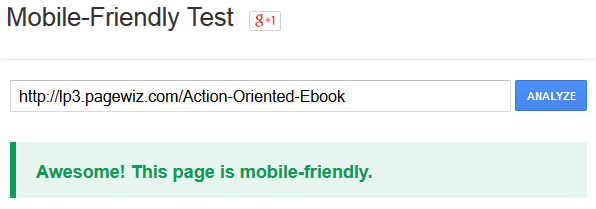
After you set up your mobile landing page version and connect it to your desktop one, so it is dynamically served to mobile visitors, you can go ahead and check it out on this free Google 'Mobile-Friendly Test' tool, which will let you know whether or not your landing page is mobile friendly.
I’d love to hear if I've missed anything, or if you think I have it completely wrong. Let me know in the comments area below.
Author’s Bio:
KOBE BEN ITAMAR
Kobe joined Pagewiz as a campaigns manager and front end developer. He has 2.5 years of landing page campaigns creation experience and a passion for driving them towards a higher conversion rate. Prior to his entry into the online world, he worked as a goats’ shepherd. On his free time, Kobe likes to practice Capoeira and take his dog (Giga) for long runs in the park.

Pavel Bíbr says:
The voting thing in your article looks wierd on my phone. Actually I don’t understand why is it here at all.
Pavel, reading your page on the mobile phone. Google Chrome.
Tom says:
You’re not wrong.
Would be interested in services that supply a mobile landing service if anyone know any.
Cheers.
Tom.